· 3 min read
Kaan Barmore-Genç

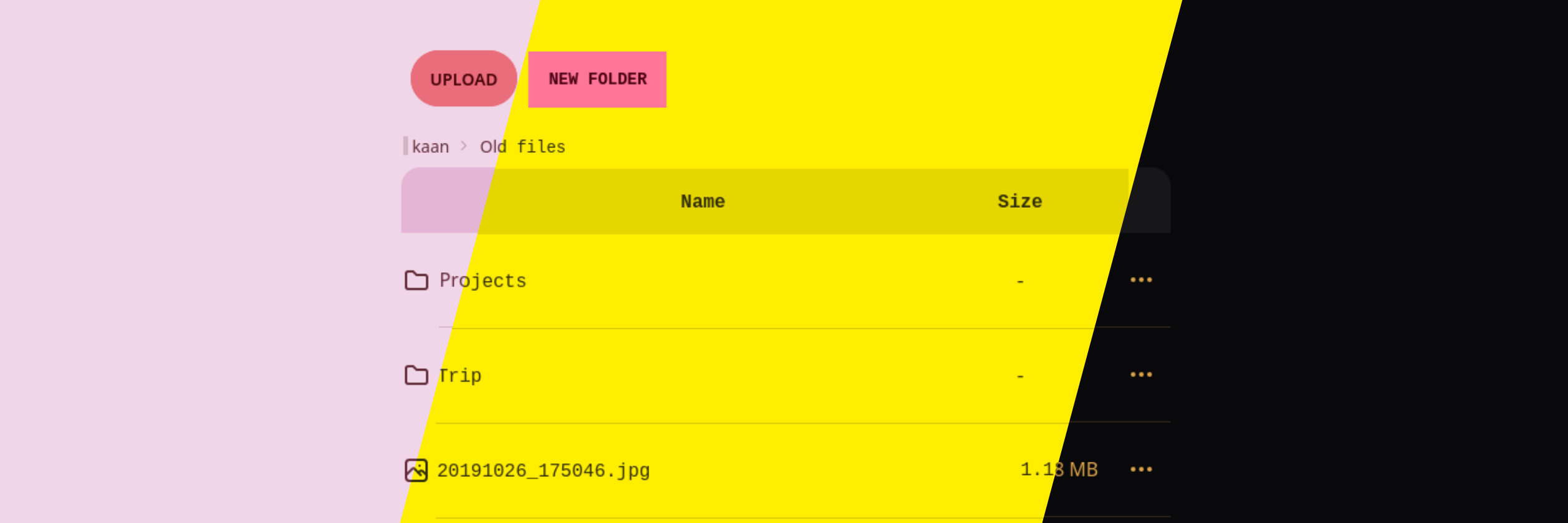
The Bulgur Cloud user interface, with 2 diagonal cuts down the middle separating it into 3 sections. The leftmost section has a light pink background with reddish pink, rounded buttons. The middle section has a yellow background with square, hot pink buttons. The right section has a black background with gold text.

Starting with the 0.4.0 version, Bulgur Cloud moved from React Native and Expo to Next.js. We also moved from NativeBase to TailwindCSS and DaisyUI.

This was almost a complete rewrite of the user interface. Between switching from React Native components to HTML elements, and going from NativeBase with CSS-in-JS to a CSS utility framework, all the UI besides redux stores and client hooks was re-rewritten.

· 2 min read
Kaan Barmore-Genç

Welcome everyone!

Two people holding a cake with lit candles.

Bulgur Cloud is a passion project for me. After finding the existing cloud storage options lacking -- stuff like Google Drive because I have no control over my own data, and NextCloud because it is highly complex and hard to run -- I decided to start a new project to solve my woes. That was almost a year ago!

Over the last year, Bulgur Cloud has grown from a barely-functioning demo to something that is almost good enough to use day-to-day already. While progress hasn't been incredibly fast, it has been at a steady pace.